The WooCommerce checkout process is the final and the most important part of your customer’s shopping journey. It’s when they actually buy your product or abandon their cart altogether.
A well-optimized checkout can improve the user experience and boost sales—a win-win. Whether you’re new to WooCommerce or looking to fine-tune your existing setup, these optimization tips will help you create a seamless and efficient checkout experience for your online customers.
Benefits of WooCommerce checkout optimization

You may already be spending time and money refining your online branding or investing in automated marketing platforms. But you need customers to take the leap and purchase your product. That’s why optimizing your WooCommerce checkout process is essential for your online store’s success. Here are some of the key benefits:
- Increased conversion rates: Put simply, a streamlined checkout process reduces friction. Less friction and fewer obstacles make it easier for customers to complete their purchases. Fewer steps and a smoother flow lead to higher conversion rates and more sales.
- Reduced cart abandonment: Complicated or lengthy checkout processes are a major reason for cart abandonment. That’s why simplifying the checkout and making payment easier is so essential. It means you minimize the chances of customers leaving their carts without purchasing.
- Improved user experience: Online shopping is only enjoyable if it’s seamless and hiccup-free. A well-optimized checkout is part and parcel of this seamless experience.
- Higher customer retention: The last thing you want your customers to think after finally paying for their products is “never again”. Customers who have a positive checkout experience are more likely to return for future purchases. Reduce hassle during checkout, and you’ll turn first-time buyers into repeat customers.
10 WooCommerce checkout optimization tips and how to implement them
Now that you understand why checkout optimization is so essential, let’s dive into some tips for improving it. You’ll also find all the info you need about how to apply these tips to your WooCommerce store.
1. Simplify the checkout process

No one likes a complicated checkout. It’s vital that you reduce the number of steps required to complete a purchase. You should consider implementing a one-page checkout where everything, from billing details and shipping info to payment options, are all handled on a single page. The fewer clicks, the better.
To do this, use a WooCommerce plugin like WooCommerce One Page Checkout to combine all of your checkout steps into one page. Make sure this page is intuitive and easy to navigate, and only ask for essential information.
2. Enable guest checkout
While encouraging users to create an account with your online store is useful for email marketing and data collection, we don’t always want to sign up for yet another mailing list.
Forcing users to create an account can lead to cart abandonment. Instead, allow guest checkout to remove this barrier. If you want to encourage account creation, offer it as an option after the purchase is complete or offer incentives such as a first purchase discount.
Setting this up is simple. In your WooCommerce settings, go to Accounts & Privacy and check the option, “Allow customers to place orders without an account”.
3. Optimize for mobile users
When was the last time you made an online purchase using your smartphone? A significant chunk of shoppers will be on mobile devices, so make sure your checkout is fully responsive.
Some simple ways to do this are large buttons and easy-to-tap fields along with a clutter-free design. Make sure you test your checkout process on different devices and use tools like Google’s Mobile-Friendly Test via the Search Console. That way, you can always keep tabs on how well-optimized your online store is.
To make this even easier, choose a responsive WooCommerce theme like Astra or StoreFront that adapts easily to mobile screens.
4. Offer multiple payment options

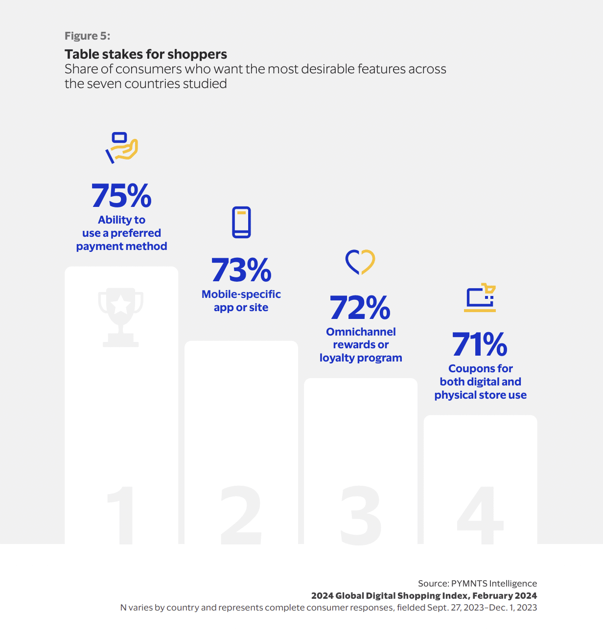
There are so many payment options to choose from now, and chances are your customers will have a range of preferences. If you want to meet customer expectations, you’ll need to offer a variety of payment gateways like credit cards, PayPal, Apple Pay, and Google Pay.
The more options you provide, the more likely your customers will find a payment method they’re comfortable with.
Luckily, WooCommerce supports a wide range of payment gateways. To add more options, go to the Payments section of your WooCommerce settings and enable each payment method you want to provide. You can also use specific plugins for different payment types so you can offer even more options.
5. Use clear call-to-action buttons
The last thing you want is a customer about to make a purchase but unable to figure out how. Your “Checkout Now” button needs to stand out. Use contrasting colors and clear, actionable text like “Complete Purchase” or “Pay Now”. Avoid using generic buttons like “Submit” or “Next”.
You can customize your checkout button by going to Appearance > Customize > Additional CSS. From here, you should add custom CSS to make your button stand out.
6. Show progress indicators

Sometimes, putting your entire checkout process on one page simply isn’t possible. If you have a multi-step checkout process, you should add a progress bar or indicator at the top of the page. With this, you will reassure customers and reduce frustration by letting them know how close they are to completing their purchase.
There are various WooCommerce plugins you can use to achieve this. ThemeHigh’s MultiStep Checkout is a great free option, while YITH WooCommerce Multi-step Checkout is a pricier but more comprehensive plugin that covers many of the tips suggested here.
7. Implement autofill and validation
You click to enter your email and a little dropdown box lets you select it without the need to type it out. We’re so used to this functionality it can be irritating when it’s not offered.
You should speed up your checkout process with autofill for addresses and card details. Instant validation for input fields (like notifying users of a wrong card number) can also help avoid errors that could lead to abandoned carts.
WooCommerce supports built-in browser autofill. Make sure your form fields are labeled correctly (for example, use autocomplete=“name” for the name field). For real-time validation, you can use plugins like WooCommerce’s Checkout Field Editor as this allows you to add field validation rules.
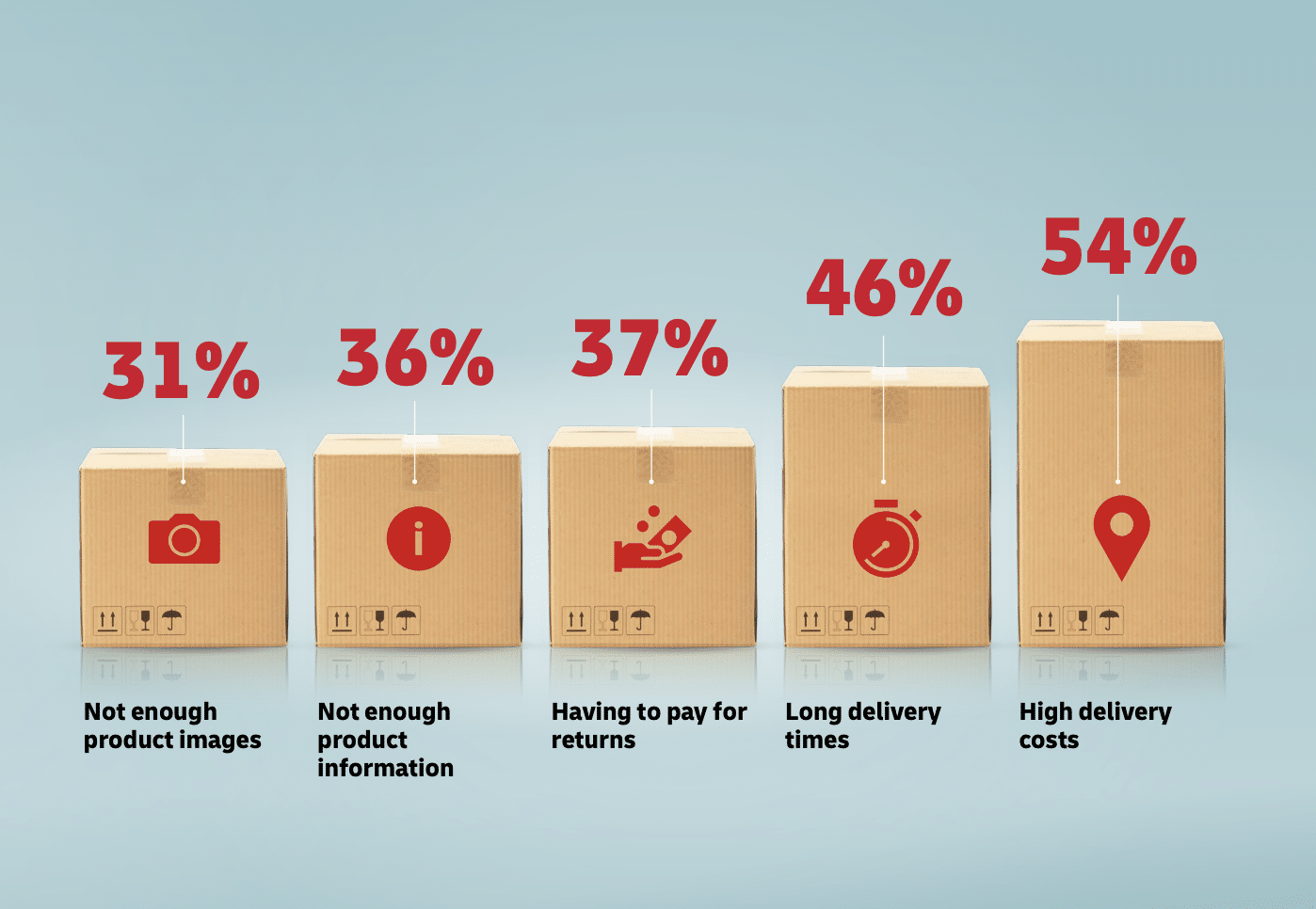
8. Offer free shipping

Free shipping is a great incentive for potential customers. If you can’t offer it on all orders, think about providing it for orders over a certain amount. You could also show customers how close they are to a discount or free shipping to encourage them to add more items to their cart.
You can set up free shipping rules in WooCommerce > Settings > Shipping. Here, you can choose to offer free shipping for orders over a certain amount or during promotions.
And if you want to let customers know when they’re close to getting free shipping, you’ll need to install the WooCommerce Cart Notices plugin to display these messages. Be sure to make them engaging and clear as a simple way to increase average order values.
9. Provide trust signals

No one wants to get scammed online. That’s why customers need to feel secure when making a purchase from your website. To help with this, you should display trust signals such as SSL certificates and secure payment icons as well as certified customer reviews. Including these on your checkout page can boost confidence in your website and reduce hesitation.
For B2B companies, showcasing certifications and using B2B SEO tools to improve your search visibility is especially important and is a great way to establish trust and credibility.
It’s vital you make sure your SSL certificate is active. Then all you need to do is use a plugin like WP Simple Pay to display secure payment icons too. You can also use a plugin like YITH WooCommerce Reviews to display customer reviews and ratings on your checkout page.
10. Include a live chat option
Sometimes customers have last-minute questions before completing a purchase. They don’t want to wait around for an email back, so let them chat with you live instead.
A live chat feature on the checkout page can help address any concerns in real-time. This reduces the chance of customers leaving your site without buying and can also improve the overall customer experience.
Adding a live chat option is simple. Install a plugin like tawk.to or LiveChat for WooCommerce. Make sure that the chat is easy to access and monitored during peak shopping hours so you can always provide real-time assistance to customers.
Final thoughts
You can obsess over getting the color palette or logo just right on your online shop, but you need to remember to create a smooth and hassle-free checkout experience too.
Remember, too, that optimization isn’t a one-time task. While the above tips can make a difference, it’s essential that you regularly test your checkout process and gather feedback from your customers. What works today might need tweaking tomorrow, so stay proactive and keep making improvements.
Ultimately, a checkout process that evolves with your customers’ needs will keep them coming back again and again.


